Why Gemstone Looks Black in Center Saturation Tone Explained
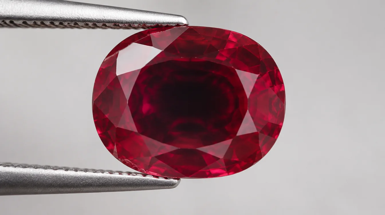
A colored gemstone looks black in the center for three reasons. Its tone may run too dark. Its saturation may drop too low. Or its cut may send light straight through instead of bouncing it back to your eye. This has nothing to do with dirt, damage, or a bad angle in the light. It comes down to how gemstone grading measures hue, saturation, and tone together. A stone can be technically the "right" color and still look dead in the middle.
What Actually Causes a Gemstone to Look Black in the Middle
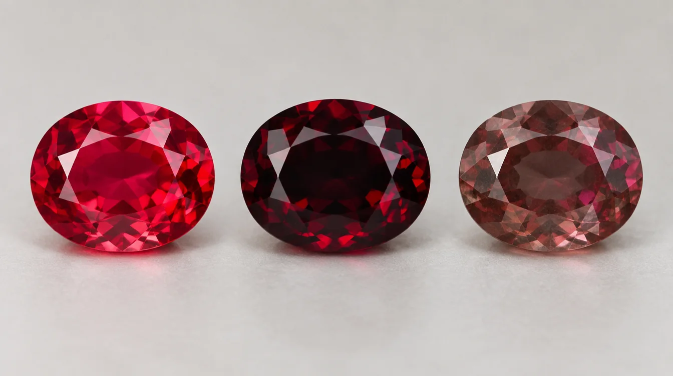
A dark center almost always comes from tone and saturation working against each other, not from the hue itself. Gemologists split color into three separate things. Hue is the actual color family, like red or blue. Tone is how light or dark that color sits. Saturation is how pure or muddy the color reads. A stone can have a gorgeous hue and still go black in the face-up view. This happens when the tone is too heavy, or when gray or brown drags the saturation down.
Think of tone as a dimmer switch. Turn it too far down, and every color eventually becomes black. It doesn't matter how nice the hue was to begin with. Most buyers never learn this. Then they end up holding a stone that looked amazing in a photo, but disappointing in person.
Why Tone Matters More Than People Realize
Tone is the single biggest reason people ask why gemstones look dark in the center. The GIA grades tone on a 0 to 10 scale, where 0 is colorless and 10 is black. Most fine colored stones sit between 4 and 7. Push past that, and you start losing light return, even in a well-cut stone. A tone of 8 or 9 can look striking in a small deep red garnet or a heavily saturated sapphire. Scale that same stone up, though, and the center starts to close in on itself.
I've watched clients fall for a ruby that looked like liquid wine in the store's spotlighting, then hold it under a window and watch the middle go flat and dark. That's tone doing exactly what tone does. It's not a defect. It's physics working against the size and depth of the stone.
Why Saturation Is the Quiet Culprit
Low saturation can also fake the look of darkness. This can happen even when tone seems fine on paper. A grayish or brownish modifier muddies the hue. Muddy color reads as darker than it really is. This is why gemstone color saturation explained properly always separates saturation from tone. The two still interact constantly, though. A stone with medium tone but low saturation can look almost as dead in the center. Picture it next to one with dark tone and high saturation. They get there through different paths. But the visual result, a black or muddy core, looks similar to an untrained eye.
Once you understand tone and saturation as separate variables, ask the next question. Which gem materials run into this problem most often? That brings us to iron.
Why Iron-Heavy Rubies Are the Classic Example of This Problem
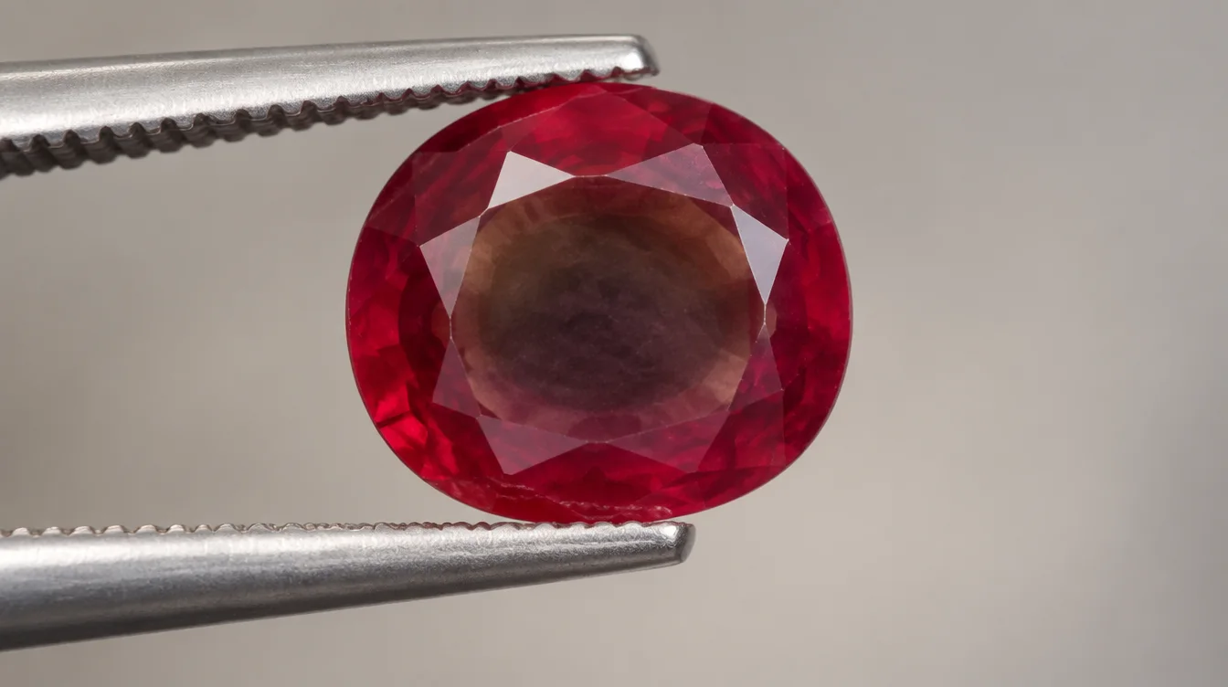
Iron content in ruby and sapphire is one of the most common reasons a stone loses color depth exactly where it should shine. Iron acts as a natural saturation killer. It pulls the red or blue toward brown or gray. In high enough amounts, it deepens the overall tone at the same time. You end up with a stone that fights itself. The hue wants to read red, but the iron drags it toward brownish-black. This shows most through the thickest part of the stone. That thickest part is usually the center.
This is different from origin snobbery. It's not that iron-rich rubies are automatically bad. Some origins are simply known for higher iron content in their typical rough. Cutters have to work around it. A ruby with strong iron influence can still be a beautiful stone. It needs the right size and cut. But push the carat weight up, and that same iron content changes. What was manageable at one carat becomes a black hole at three carats.
How This Differs From Pleochroism
Pleochroism is a different problem. Confusing it with tone and saturation leads to bad buying decisions. Pleochroic stones, like tanzanite or iolite, show different colors depending on the angle you view them from. This happens because light travels differently through the crystal's optical axes. That's an angle problem. Rotate the stone, and the color shifts. A saturation and tone problem doesn't rotate away. Tilt a stone with a genuinely dark center under a lamp. The dark patch stays roughly in the same spot. It stays there no matter how you turn the stone. That's because it comes from depth and light absorption, not crystal orientation.
Knowing the difference matters when you're evaluating a stone in person. If turning it fixes the darkness, that's pleochroism or a lighting angle issue. If the center stays dark no matter what you do, tone and saturation are working against the stone's proportions. That brings us to the part buyers overlook most: the cut.
Gemstone Cut Affects Color Depth More Than Most Buyers Expect
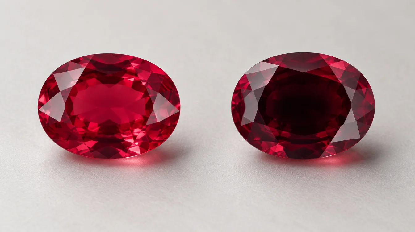
The cut of a gemstone decides something important. It decides whether the stone's natural color reaches your eye, or gets trapped inside. Rough gemstone material is expensive. Cutters are typically paid by the carat they preserve. That creates a real incentive to cut a stone deep. This keeps as much weight as possible below the girdle. Cutters do this even when a shallower cut would show the color better. The result is a stone that weighs more on paper. But it performs worse face-up.
A deep cut increases the distance light has to travel through the gem material. Up to a point, that's good. It's part of why a well-cut ruby or sapphire can look richer than a shallow one. But there's a line. Past that line, the extra depth just absorbs light instead of returning it. The pavilion angles get too steep, and light exits out the sides or bottom instead of bouncing back through the crown. You end up with a dark, dead patch sitting right in the middle of the stone.
Windowing Versus Extinction: Two Different Cut Problems
These two cutting flaws sit on opposite ends of the same spectrum, and both hurt color depth. Windowing happens when a stone is cut too shallow. Light passes straight through the center like looking through a window, leaving a washed-out, pale zone instead of even color. Extinction is the opposite problem. The stone is cut too deep, so light gets trapped and absorbed before it can bounce back out. Instead of a pale patch, you see a dark or black one.
Both problems come from the same root cause. The proportions don't match the stone's natural color strength. A highly saturated ruby needs a shallower cut than a pale one. It doesn't need as much light travel to show rich color. Cut it too deep anyway, chasing extra carat weight, and the result changes. A stone that could have looked vivid turns into a dark mass with just a hint of red at the edges.
A Simple Way to Check for Extinction Before You Buy
Tilting the stone slowly under a single light source is the most reliable at-home test for extinction. Hold the gemstone under a lamp, and move it slowly back and forth. A well-proportioned stone stays lit as it moves. The color shifts a little, sure, but the whole face keeps some life in it. A stone with a real extinction problem holds a dark patch that travels with your eye no matter how you angle it. No ring setting fixes that. No lighting fixes it either. It's baked into the proportions.
Cut explains a lot of this, but it doesn't work alone. Grading systems try to account for all three color factors at once. Understanding how that works helps you talk to a jeweler with more confidence.
Tone vs Saturation Gemstone Grading: How the Two Interact in Practice
Tone and saturation are graded as separate values. In a finished stone, though, they show up together as one visual impression. This is where a lot of the confusion around colored stone grading hue tone saturation comes from. On paper, you might see a stone described as medium-dark tone with vivid saturation. That sounds like a contradiction until you picture it. It means strong, pure color. That color also sits on the darker side of the tone scale. That combination can look rich and glowing in a smaller stone. In a larger, deeper stone, it can look nearly black.
The GIA colored stone system treats tone and saturation as independent scales. That's because a stone can be strong in one and weak in the other. A pale, washed-out amethyst has low tone and low saturation together. A gorgeous, medium-toned tsavorite garnet has moderate tone and high saturation. That's why it reads so vivid without going dark. Learning to see these as two separate dials, instead of one blurry impression, is the real skill here.
Why the Same Species Can Look Completely Different Stone to Stone
Two rubies of identical carat weight and origin can land in totally different tone and saturation zones. That's normal for this gem category. It's part of why there's no universal grading scale for colored stones like there is for diamonds. A 2-carat ruby with medium tone and vivid saturation might cost several times more than a 2-carat ruby with dark tone and moderate saturation. This is true even if both stones are the same species from the same mine. Carat weight tells you almost nothing about how a stone will look on a hand.
This is exactly why comparing stones side by side matters so much more than judging one stone alone. If you're shopping for something like a ruby, learn this hue, tone, and saturation relationship first. Do it before you fall for a stone under store lighting. Our ruby engagement ring guide walks through how these grading factors play out in ruby buying. Ruby is one of the gem categories most affected by this exact problem.
What to Actually Look For When Evaluating a Dark Gemstone
Evaluating a potentially dark stone comes down to three checks. Look at it under multiple lights. Watch for a stable dark patch. Compare it against similar stones side by side. Start with lighting variety. A stone that looks fine under a jeweler's spotlight can go dead under daylight. It can also go dead under a plain LED bulb at home. Ask to see the stone under at least two different light sources before deciding anything.
Next, do the tilt test mentioned earlier. Move the stone slowly. Watch whether the dark area travels with it or stays fixed. A fixed dark zone in the center is a proportion problem. It's permanent. No amount of polishing or re-setting will bring that color back. Finally, ask about size scaling. A stone with strong saturation and darker tone might look perfect at half a carat. It can look completely different at two carats. Depth increases with size in most standard cutting styles.
Comparing Stones Side by Side Instead of Alone
A single gemstone, photographed or viewed alone, gives you almost nothing to judge it against fairly. Put three or four stones of similar hue next to each other. The differences in tone and saturation jump out immediately. One will look grayish. One will look a shade too dark. One will hold clean, even color from edge to edge. This is standard practice among dealers working with parcels of stones. It works just as well for a single buyer comparing options at a counter.
Durability and long-term color stability matter here too. This matters most for a stone you'll wear daily. Sapphire holds its saturation and tone remarkably well over years of wear. That's part of why it's such a popular alternative to other colored stones. If you're weighing that kind of decision, our comparison of sapphire vs moissanite engagement rings covers how color depth holds up differently between the two over time.
Common Questions About Gemstones Looking Dark in the Center
Why does my gemstone look black in bright light instead of showing color?
Bright, direct light can actually make a dark-toned stone look worse, not better. When too much light enters a deeply cut stone, more of it gets absorbed before it exits. This can make the dark zone stronger instead of lighting it up. Softer, angled lighting often shows a dark stone's true color more evenly than harsh direct light does.
Can a jeweler fix a gemstone that looks dark in the center?
Recutting is sometimes possible. But it means losing carat weight to improve the proportions and light return. This only makes sense on a valuable stone. Even then, there's no guarantee the darkness fully goes away. Most of the time, careful buying beats fixing the problem later.
Does a darker gemstone always mean lower quality?
Not necessarily. Medium-dark tone is actually where many fine stones perform their best. Quality drops when tone runs so dark it stops returning light. That's typically past 7 or 8 on the GIA's 0 to 10 tone scale. Tone and saturation work together. Together, they decide whether dark means rich or means dead.
How do gemstone treatments affect this darkness issue?
Heat treatment can improve saturation and clarity in stones like sapphire. This sometimes helps a stone read less muddy overall. It doesn't change the stone's cut proportions, though. A heat-treated stone with a too-deep pavilion will still show a dark zone in the center. Treatment and cut are separate factors. Both affect the final look.
What's the difference between a gemstone looking dark from tone versus from pleochroism?
Tone-related darkness stays put no matter how you rotate the stone. That's because it comes from depth and light absorption. Pleochroism shifts as you turn the stone. That's because you're seeing different optical axes of the crystal at different angles. Testing this yourself just takes a slow tilt under one steady light source.
Getting This Right Before You Buy
A dark center in a colored gemstone almost never means something is mysteriously wrong with it. It means the tone, saturation, and cut are interacting in a specific, explainable way. Once you know what to look for, you can spot it before you hand over payment. Ask to see the stone under different lights. Do the tilt test. Compare it against a few similar stones instead of judging it alone. These are the same habits a trained gemologist relies on. They work just as well for a first-time buyer at a jewelry counter. If you're shopping for a colored stone and want a second opinion on its tone and saturation, reach out. We'll walk through it with you.