Engraved Necklace Readability Placement Mistakes Ruining Your Text
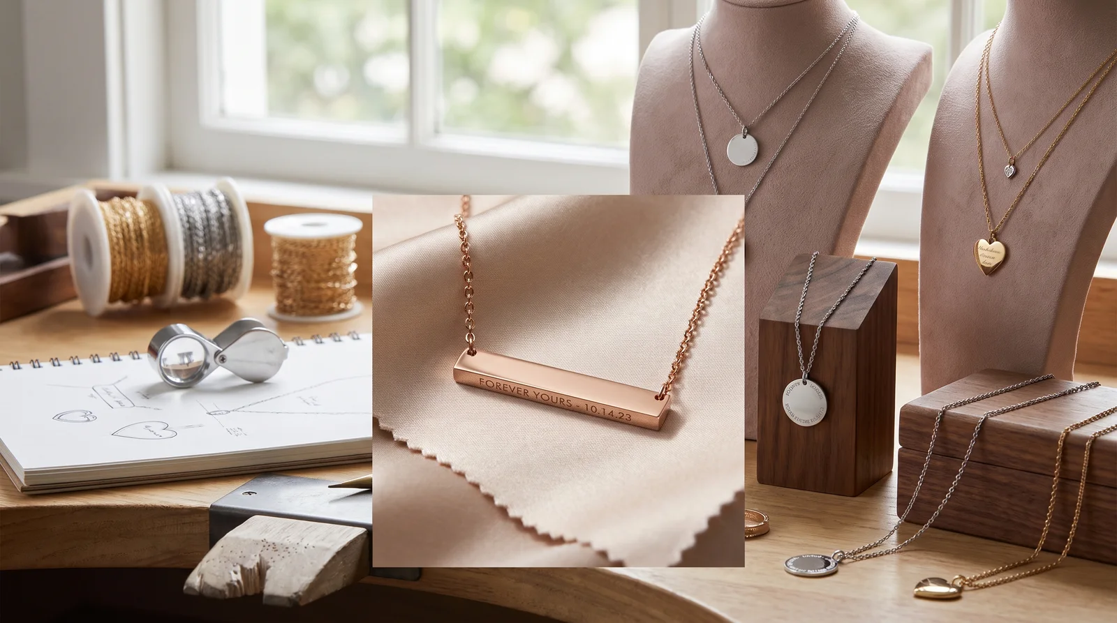
Engraved necklace readability placement depends on three things working together: pendant shape, chain length, and where the text sits relative to your collarbone. Get any one of these wrong and the words flip upside down, tilt sideways, or vanish into a shirt collar. The fix is simple. Choose a shape that holds text flat. Pick a chain length that keeps the pendant in open view. Position the lettering where daily movement won't distort it.
What Actually Determines Whether Engraved Text Stays Readable
Readability comes down to how the pendant sits against your body. It's not just about how deep or fancy the engraving looks. A jeweler can cut a beautiful line of script. But if the pendant rotates every time you reach for your seatbelt, nobody reads a word of it. Customers often return pieces they loved in the store because the text kept flipping face-down within a week of wear.
Three mechanical factors control this outcome. Pendant shape determines how much flat, stable surface the engraving has to work with. Chain length determines where the pendant lands on your chest, which affects both visibility and how much the pendant swings. Positioning matters too. That means where on the pendant the text sits, and which direction it faces. This decides whether the words read correctly once the piece settles naturally.
None of these factors work alone. A bar pendant on a chain that's too long will sit lower, catch more movement, and rotate more often than the same bar on a shorter chain. Understanding how they interact is the real skill here. It's what separates a necklace that looks great on a stand from one that actually reads well on a body.
Best Pendant Shapes for Text Engraving
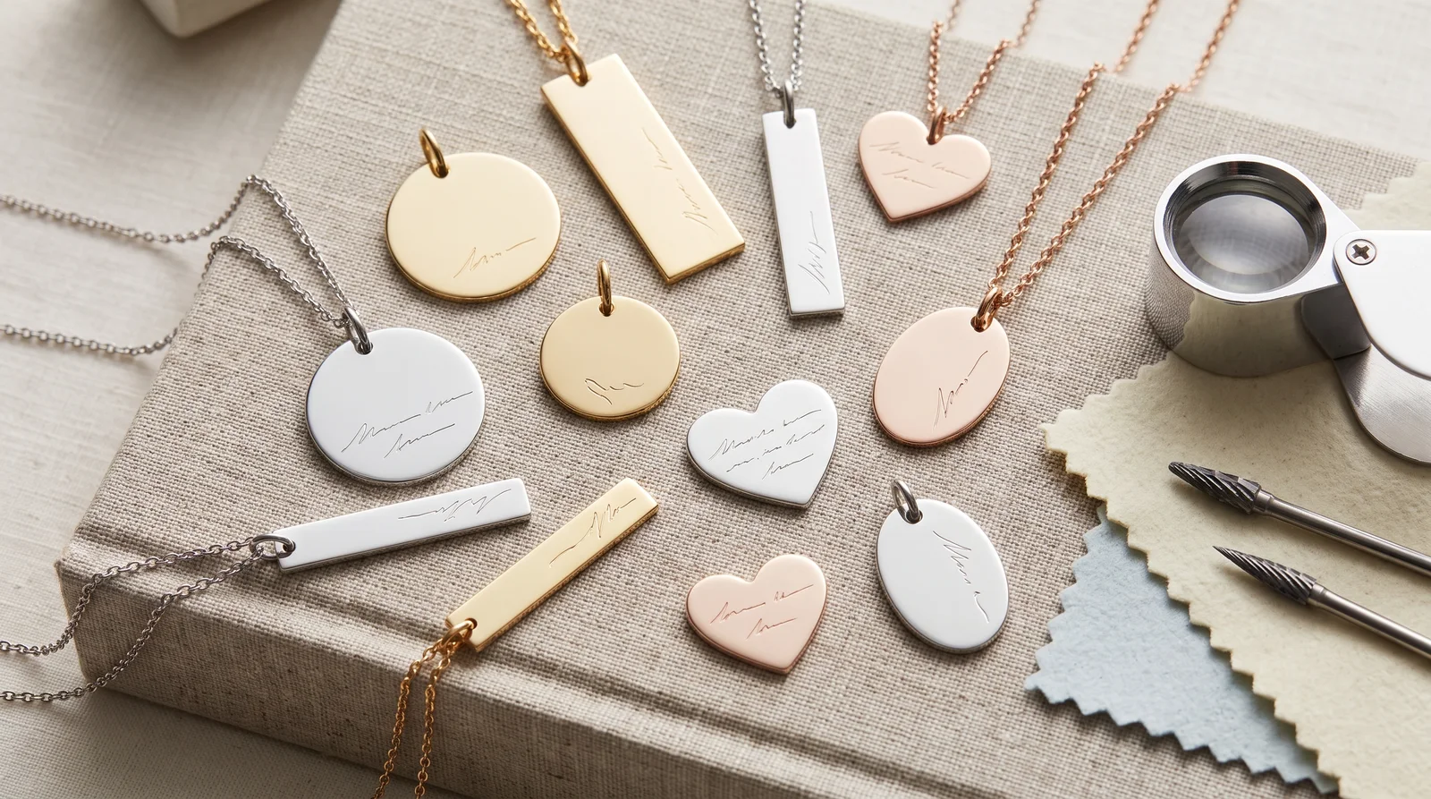
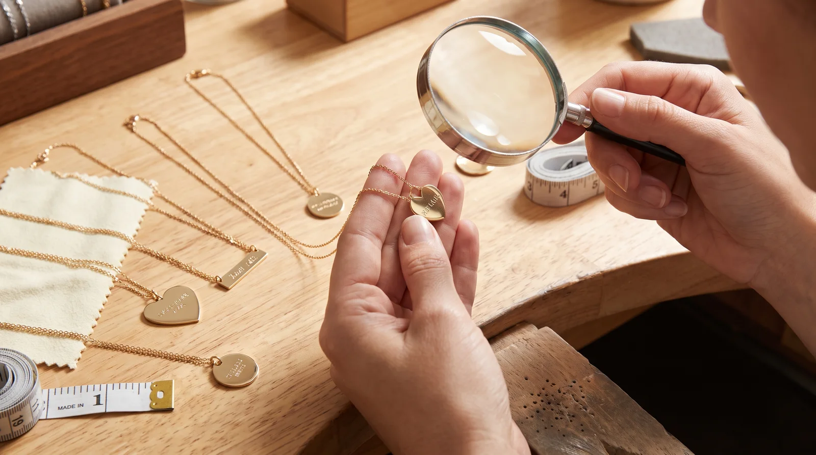
Flat, geometric shapes hold engraved text more reliably than curved or dimensional ones. Bars, rectangular tags, and flat discs give an engraver a stable, predictable surface. That means the letters stay level and don't warp around a curve. Rounded lockets and sculptural pendants look elegant, but engraving on a curved surface distorts slightly at the edges. That distortion gets worse as the pendant ages and develops surface wear.
Bar Pendants
Bar necklaces are the most text-friendly shape on the market right now, and there's a reason for that beyond trend. A horizontal bar gives you a long, flat runway for a name or short phrase. Because the bar's weight is spread evenly along its length, it resists flipping better than a small round charm. The tradeoff is that bars only work well for short text. Cram too many characters onto a two-inch bar and the font size shrinks until it's unreadable at arm's length, let alone from across a room.
Discs and Coin Pendants
Round discs read well when the text curves with the shape or sits centered in a single short line. Where discs struggle is with longer engravings that force the engraver to wrap text around the circumference. Curved text along the edge of a coin pendant is harder to read quickly, since your eye has to travel in an arc instead of a straight line. If you want a disc shape, keep the engraving to a single word or initial set in the center.
Lockets and Dimensional Shapes
Lockets, hearts, and other sculptural shapes prioritize sentiment over legibility. That's a fair tradeoff if readability isn't your main goal. The curved surfaces and hinges that make lockets charming also make them the hardest shape to engrave clearly. If you're set on a locket, keep any exterior engraving extremely short, a single initial or small symbol. Save longer messages for the flat interior surface, where the engraving won't be seen day to day anyway.
Shape sets the foundation, but it only tells half the story. The chain attached to that pendant decides whether anyone ever gets close enough to read it.
Engraved Necklace Chain Length Guide for Maximum Visibility
Shorter chains keep engraved pendants higher on the chest, where text stays visible and legible. Longer chains let the pendant drift lower, swing more, and disappear into clothing folds. This isn't a minor styling detail. It's the single biggest factor in whether your engraving gets seen at all during a normal day.
16 to 18 Inches: The Readable Zone
A 16 inch chain sits at or just below the collarbone, the tightest, most stable position on the body. There's less fabric movement at this height, less swinging, and the pendant stays close enough to the neck that text reads clearly at a glance. An 18 inch chain, the most common length sold, drops the pendant about an inch or two lower. It's still within easy reading range, but with slightly more sway during activity like walking or bending.
20 Inches and Beyond: Where Text Starts Disappearing
Once you get to 20 inches, the pendant typically falls into the neckline of most shirts and dresses, especially with crew necks or higher collars. That means the engraving spends most of the day hidden, only surfacing when the wearer leans forward or the fabric shifts. Longer chains also increase swing radius. Even when the pendant is visible, it moves more, making short glances harder to resolve into actual words.
If you're deciding between two lengths and readability is the priority, size down rather than up. A pendant sitting slightly higher than expected reads better than one sitting lower and swinging. Chain length isn't just about how the necklace drapes visually. It also interacts directly with how the pendant is anchored, which brings up the question of chain thickness.
How to Choose Chain Thickness for Pendants Without Sacrificing Legibility
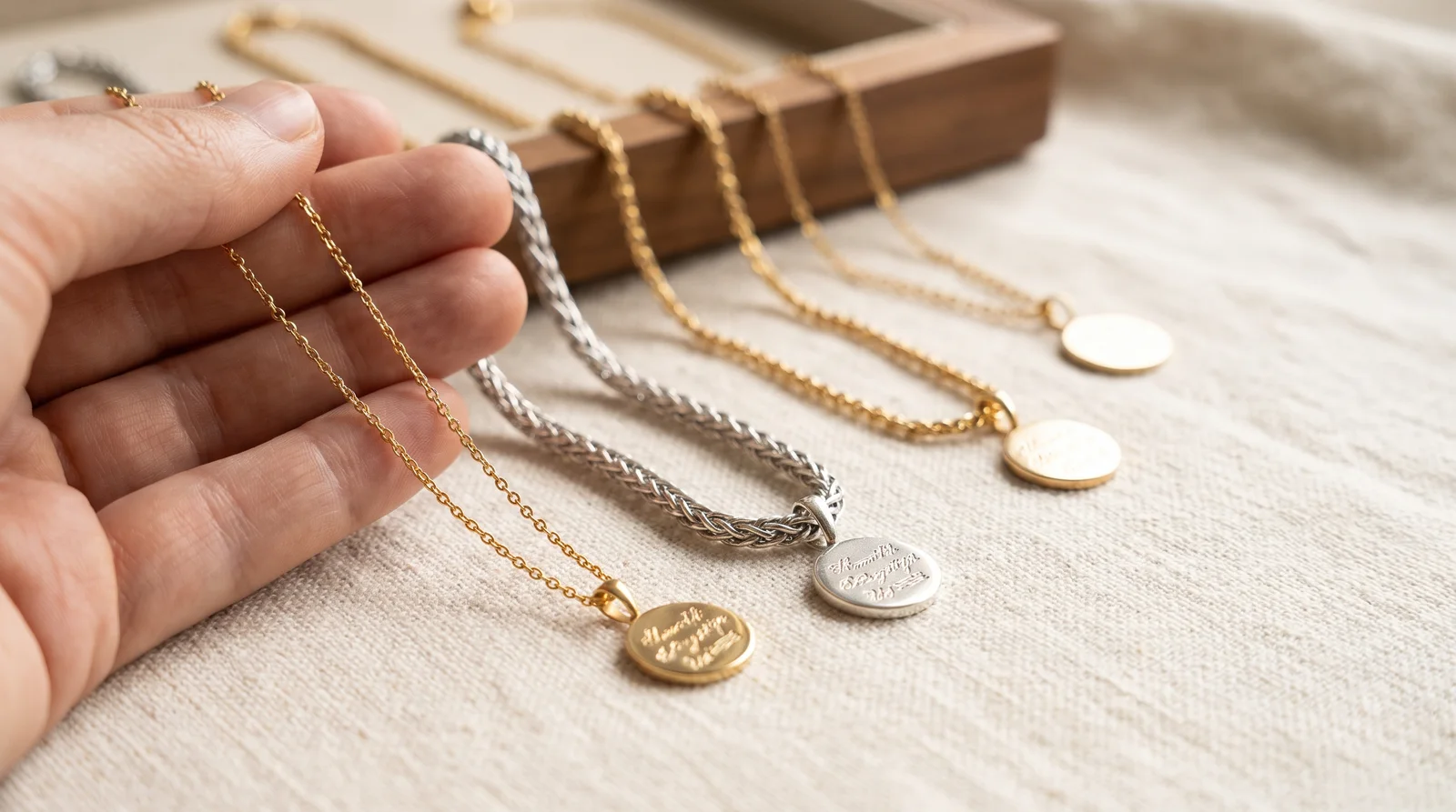
Chain thickness needs to match pendant weight, because a mismatch causes exactly the kind of movement that ruins readability. A heavy engraved bar on a thin 1mm chain will tilt, drag to one side, and flip far more often than the same bar on a sturdier link. Thicker chains, generally in the 1.5mm to 2.5mm range for pendant necklaces, hold weight more evenly and keep the pendant centered where it belongs.
The connector between chain and pendant matters just as much as the chain itself. The bail is the small loop that attaches the pendant to the chain. If it's too wide or too smooth, the pendant will spin freely and face whichever direction gravity and movement push it. A snug bail paired with a slightly textured chain style, like a curb or figaro link instead of a smooth snake chain, keeps the pendant facing forward more consistently throughout the day. For a deeper look at how chain construction affects weight distribution and durability, this comparison of solid vs hollow gold chain for pendant options breaks down which structure holds up better under a heavier engraved piece.
Getting the thickness right solves half the movement problem. The other half comes down to where the clasp sits and how often it migrates. That's a separate but closely related issue.
Custom Necklace Text Placement Tips That Prevent Flipping and Tilting
Text placement should account for the pendant's natural resting orientation, not just how it looks in a flat product photo. Engravers sometimes center text based on how the pendant lies on a table. But a pendant on a body behaves differently once gravity and the bail's rotation come into play. The safest placement keeps text horizontal and centered along the pendant's widest, flattest axis. That reduces the visual impact if the piece tilts slightly during wear.
Front-Facing Stability
One of the most common complaints jewelers hear has nothing to do with the engraving itself. It's that the clasp keeps sliding around to the front, taking the pendant with it and turning the text sideways or backward. This happens more with heavier pendants and looser-fitting chains, and it's worth understanding before you commit to a design. If you've noticed this on a piece you already own, this explanation of why does my necklace clasp move to the front covers the mechanics and a few practical fixes.
Depth and Font Weight
Engraving depth affects legibility more over time than it does on day one. A shallow engraving on a bar pendant might look crisp in the store. But daily contact with skin, clothing, and oils gradually softens the lines. Deeper engraving paired with a bolder, simpler font resists that wear far better than a delicate script cut at minimal depth. For pieces meant to be worn daily rather than saved for special occasions, ask your jeweler about engraving depth specifically, not just font style.
Placement and depth work together to keep text legible in the short term and the long term. But there's a third variable that often gets overlooked entirely, and it has to do with the actual shape of the letters themselves.
Pendant Font Readability for Engraved Jewelry in Real-World Conditions
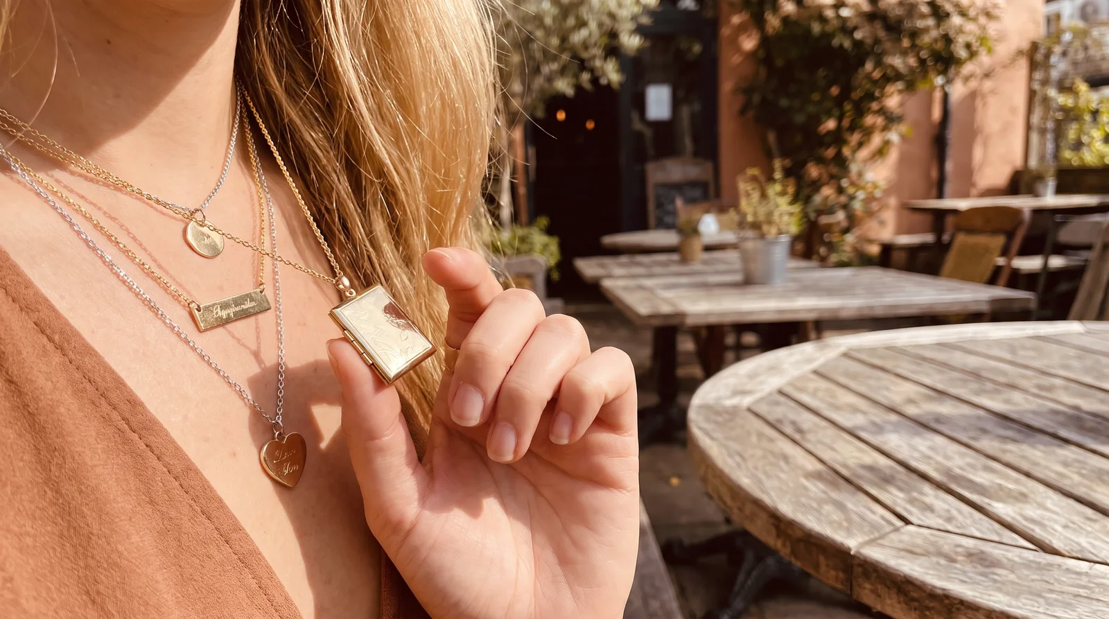
Font choice matters most at the size engraving actually happens, not at the size you see on a screen during design. A script font can look graceful in a digital mockup. But it can collapse into an illegible smudge once scaled down to fit a 0.75 inch bar. This is one of the most common mismatches between expectation and outcome in custom jewelry. It's also entirely preventable.
Block Fonts for Small Pendants
Simple, sans-serif block lettering holds up best on small surfaces because each letter is a clean, separated shape. There's no risk of connecting strokes blurring together. The geometric lines engrave more precisely than ornamental scripts. Short names, three to five letters, look sharp in block fonts even on pendants under an inch wide.
Script Fonts Need More Room
Script fonts can absolutely work, but they need a larger surface to stay legible. If you're set on a script style, test it by printing your design at the exact pendant size and looking at it from three feet away, the same distance someone would stand while talking to you. If the letters blur together at that distance, simplify the font or size up the pendant. For more on how metal choice and engraving depth interact with different lettering styles, this guide to the gold engraved necklace covers the durability side of that equation.
Font and pendant size are inseparable decisions. Once you've settled on both, the last piece of the puzzle is making sure the whole necklace, chain and pendant together, holds up to actual daily wear rather than just a photo shoot.
Putting It Together for Daily Wear
A necklace built for readability needs the shape, chain length, thickness, and font all pulling in the same direction. Start with a flat pendant shape like a bar or disc. Pair it with a 16 to 18 inch chain that keeps the piece near the collarbone. Match chain thickness to pendant weight so it doesn't tilt or drag, and choose a bail that fits snugly enough to resist spinning. Finish with a bold, simple font engraved at sufficient depth to survive years of contact with skin and fabric.
Skip any one of these steps and the whole system weakens. Gorgeous pendants with perfect engraving get ruined by a chain two inches too long. Meanwhile simple, inexpensive pieces read beautifully for years because every element was matched correctly from the start. If you're adding other elements to the design, like a small stone alongside the engraved text, it helps to think about how that affects chain selection too. This piece on birthstone necklace charms touches on balancing extra weight and detail without compromising how the main pendant sits.
With all these pieces in place, a few common questions still come up often enough to address directly.
Frequently Asked Questions About Engraved Necklace Readability
How close should engraved text be to the edge of a pendant?
Keep engraving at least 1 to 2 millimeters from the edge on most metals. Text cut too close to the border wears down faster from edge contact with skin and clothing, and it can also crack or chip on thinner pendant materials over time.
Why does my pendant keep facing backward during the day?
This usually happens when the bail is too loose or the chain surface is very smooth, letting the pendant spin freely. Switching to a snugger bail or a slightly textured chain style, like curb or figaro, keeps the pendant oriented forward more consistently.
Does chain length affect how fast engraving wears down?
Indirectly, yes. Longer chains allow more pendant movement and swing, which increases friction against clothing and skin throughout the day. More friction over months and years means engraved lines soften faster than they would on a shorter, more stable chain.
Can I fix a pendant that already flips or tilts too much?
Sometimes. A jeweler can often replace the bail with a better-fitted one or swap the chain for a thicker, more textured style without altering the pendant itself. It's worth asking before assuming you need an entirely new piece.
What's the best pendant shape if I want a longer engraved phrase?
A rectangular bar or flat tag shape gives you the most usable horizontal space for longer text. Just remember that more characters mean smaller font size. Keep phrases short, ideally under 20 characters, if you want the words to stay clearly legible.
Final Thoughts on Getting Engraving Right the First Time
Choosing an engraved necklace comes down to more than picking a pretty design off a screen. Shape, chain length, thickness, and font all decide whether your words stay readable or quietly fade into background noise on a busy day. Think about how you actually move through your day, whether you're reaching, bending, or layering scarves and collars, and choose accordingly. A little attention to these mechanical details now saves you from replacing or resizing a piece later. If you're ready to design something that reads clearly for years, take these placement principles into the conversation with your jeweler before you finalize anything.